Skins /
PreviewSkins
Summary: Screenshots that link to (some) skins.
Version:
Prerequisites:
Status:
Maintainer: PRZ
Categories: Uncategorized
Discussion: PreviewSkins-Talk
Questions answered by this recipe
See also: Skins:SkinTest-Compact.
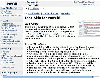 | 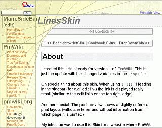 |
| Lean | Lines |
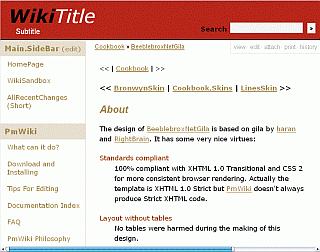 | 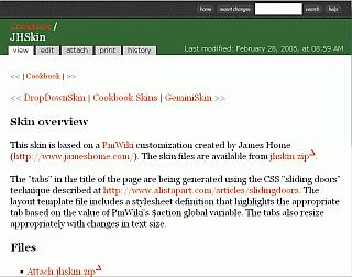 |
| BeeeblebroxNetGila | JH |
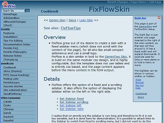 | 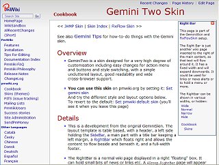 |
| FixFlow | GeminiTwo |
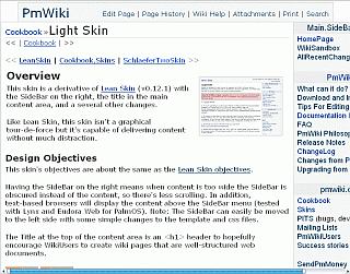 | 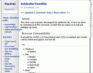 |
| Light | SchlaeferTwo |
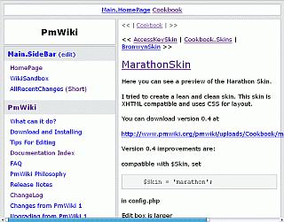 | 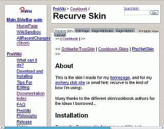 |
| Marathon | Recurve |
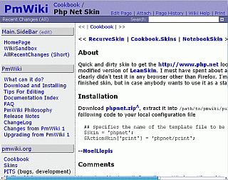 | 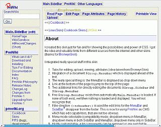 |
| PhpNet | DropDown |
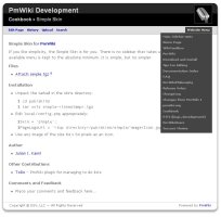 | 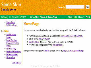 |
| Simple | Soma |
Notes and comments
As viewed on Firefox with increased font size.
The original size of the images is 855 x 673, approximatively what can be seen on a 1024x768 screen with favorite window on left.
So, this is not the 'worst case' view, but the increased font size show miscellaneous problems.
Bottom slider is shown when the browser is setting it.
I find these images slighly misleading. What is the point of having the browser's favourite (bookmarks) sidebar open when doing the shots? Also this sidebar can be dragged smaller or wider. Are the images from Firefox running on Apple Mac? I got irritated by the appearance of the horizontal slidebars, as they are mostly missing when running the browser without favourite's sidebar. - What is a "police size"? - In Gemini and FixFlow the rightbars are missing. ~Hans
Font size proportional : 22 pixels, fixed : 20 pixels, minimum 16 pixels. Firefox on PC, with a skin.
I know this is not the standard config, and so I have advised about it. This is not my home config, I have a larger screen, but what I can see at my job may be like that, or worse. Home, I have chosen the size, at job, I got no choice. Clearly, I was wanting to show what some can view (imagine on a 800x600 pixel screen !). I have a relatively poor vision, and web browsing is often a pain. And I always browse with the favorite bar open, which I use intensively for saving.
As far as I know, in western countries, between 30-40% of the population is wearing glasses (50% in the USA), I don't know the world average, but *please* handle us with care, and think vision quality loss is only a question of time...
For what everyone can consider as a his/her own standard config, there is always the link to the actual skin. One can still make the screenshots for what he/she consider as 'standard' configuration.
PRZ
I think Hans was asking you to define the phrase police size. Police is not a computer term in English, so something might be getting lost in translation. -Hagan
OOOooopps, you're right, I am sorry for that, the french 'police' is in english a 'font', one of this funny 'false friends'. Corrected. PRZ
The "percentage of the text windows" test is flawed if (as it appears) the skins' home pages on pmwiki.org are being used for the testing. The content of the page greatly influences how wide the text area will become when you change the font size. -Hagan
Table below indicates the percentage of the text windows vs the full windows (in the above context). This will be different with a smaller, larger screen or other font.
| Skin | Text | Comments |
|---|---|---|
| JH | 75% | No menu |
| Light | 70% | Menu, rather than content, gets partly hidden. |
| SchlaeferTwo | 70% | No group name, Menu options expands over their area |
| Lean | 68% | |
| Neutral | 64% | |
| Lines | 61% | |
| Default | 59% | |
| PhpNet | 57% | Title should be short |
| DropDown | 58% | Text font size reduced |
| BeeblebroxNetGila | 56% | Title should be short |
| Marathon | 51% | |
| Recurve | 46% | |
| Simple | Body background image doesn't repeat in firefox |